Spritesheets and Draggables
Tutorial Overview:
- Import and configure a spritesheet.
- Create drop target, stacking and non-stacking draggable UI slices.
- Create an interactive UI canvas with draggables.
Download Tutorial Assets
Download and save these two files to your project directory.

basic-sprites.png 32x32 sprites
Level Setup and Spritesheets
In your level, create a new entity named 'UI' and add a UI Canvas Asset Ref component as well as an Input component.
Open the UI Editor, a new blank UI canvas is created. We'll start by creating a UI slice for draggable elements that don't stack with other draggables. In the 'Hierarchy' panel of the UI editor, right-click and add a new empty element to the canvas. Rename the element to 'Draggable-Sprite'.
Right-click on Draggable-Sprite and add a new Image element from the slice library. This should automatically set the new element to be a child of Draggable-Sprite.
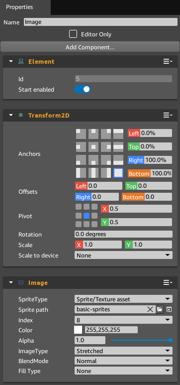
In the Properties panel of the image element, in the Transform2D component, Set the images anchors to fill all space.
In the Image Component, change the sprite path to load 'basic-sprites.png'.
Press the
 button located next to 'Sprite path' to open the Sprite Editor.
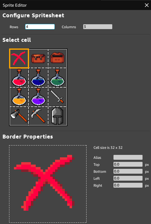
Set the number of Rows to 4 and Columns to 3.
You may optionally select each cell and assign an Alias to the sprite. The Alias is visible in the UI Editor, the Alias may also be referenced in Script Canvas and Lua.

Step 8. The Sprite Editor
Save the spritesheet in the Sprite Editor. In the Image Component, changing the Index parameter selects which sprite to use from the spritesheet. If Alias' were assigned, they are visible in the Index parameter field.
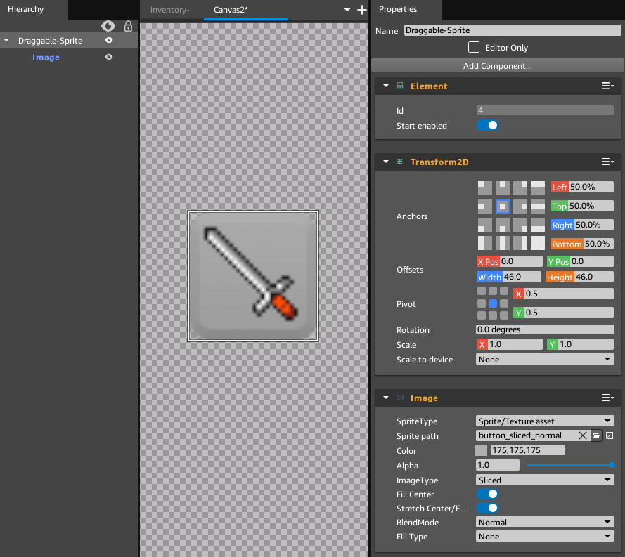
Re-select the Draggable-Sprite element. In the Transform2D component, set the anchor to be centered, X Pos and Y Pos Offsets to 0. Set the Width and Height Offsets to 46.
Add an Image component to Draggable-Sprite. This will be the background for the sprite. Change the Sprite path, open and add a sliced button image from the UI-Basics if that is available. Alternatively, any button image will work, or the Sprite path may be left blank to fill the image with a color. If a button image was added, set the ImageType parameter to Sliced. Set the color of the image to be (175,175,175) a light-gray color.

Step 11. The Draggable-Sprite Element Configuration

Step 11. The Image Element Configuration
The Draggable Component
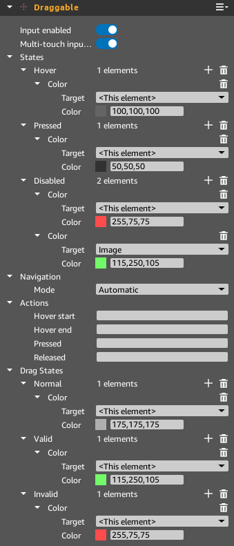
Add a Draggable component to Draggable-Sprite. Add a color parameter to the Hover and Pressed States, add two color parameters to the Disabled State. Add a color parameter to the Normal, Valid and Invalid Drag States.
By default the target of the color parameters will be set to This element. In the Disabled Hover State, change the extra color parameter that you added to target the child-element of Draggable-Sprite, Image. Set the color to (175,175,175), this will make the sprite gray when the Hover State of Draggable-Sprite is Disabled.
Set the Hover and Pressed States to be contrasting colors, (100,100,100) gray and (50,50,50) dark-gray.
The Disabled State will alert the user that a draggable cannot be pressed, (255,75,75) light-red is used.
The Normal Drag state can be the same color as the button, (175,175,175) light-gray.
The Valid Drop state uses (115,250,105) light-green, and the Invalid Drop state uses (255,75,75) light-red.

Step 17. The Draggable Component Configuration
Create a Draggable Sprite UI Slice
Add a Script Canvas component to Draggable-Sprite. In the script canvas component, press
 'Open in Script Canvas Editor' to create a new Script Canvas graph for the entity. Save the blank Script Canvas graph as 'draggable.scriptcanvas' and close the Script Canvas editor. We can edit the graph later, 'draggable.scriptcanvas' should be set as the Script Canvas Asset in the Script Canvas component.
With both Draggable-Sprite and Image selected in the Hierarchy panel, right-click on Draggable-Sprite and select Make Detached Slice from Selected Entities.... Name the slice 'Draggable-Sprite.slice' and save it to your project directory.